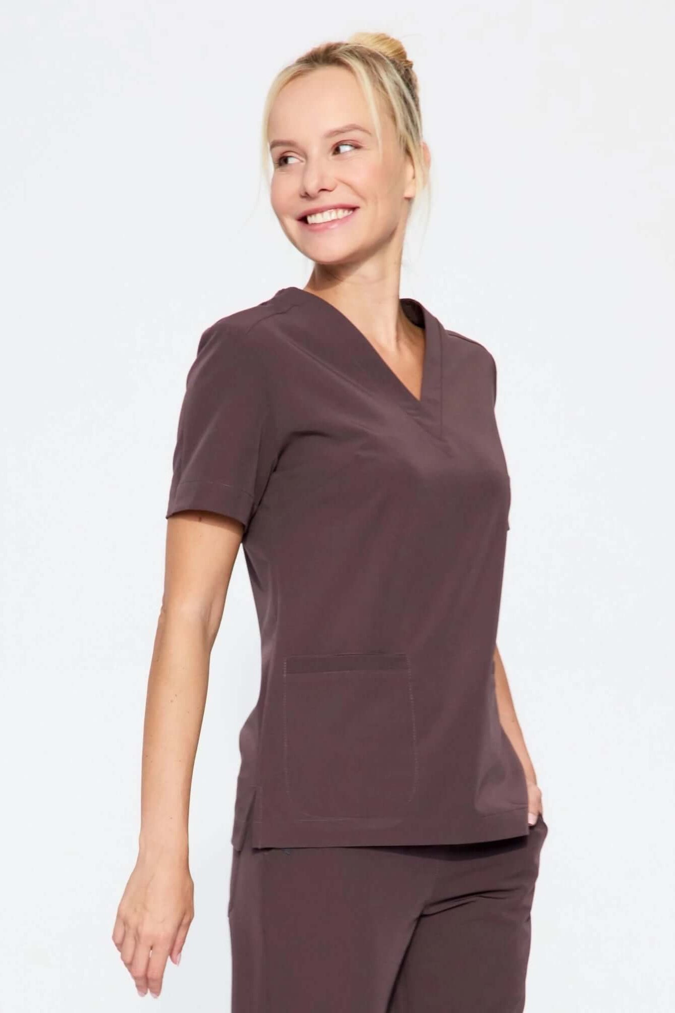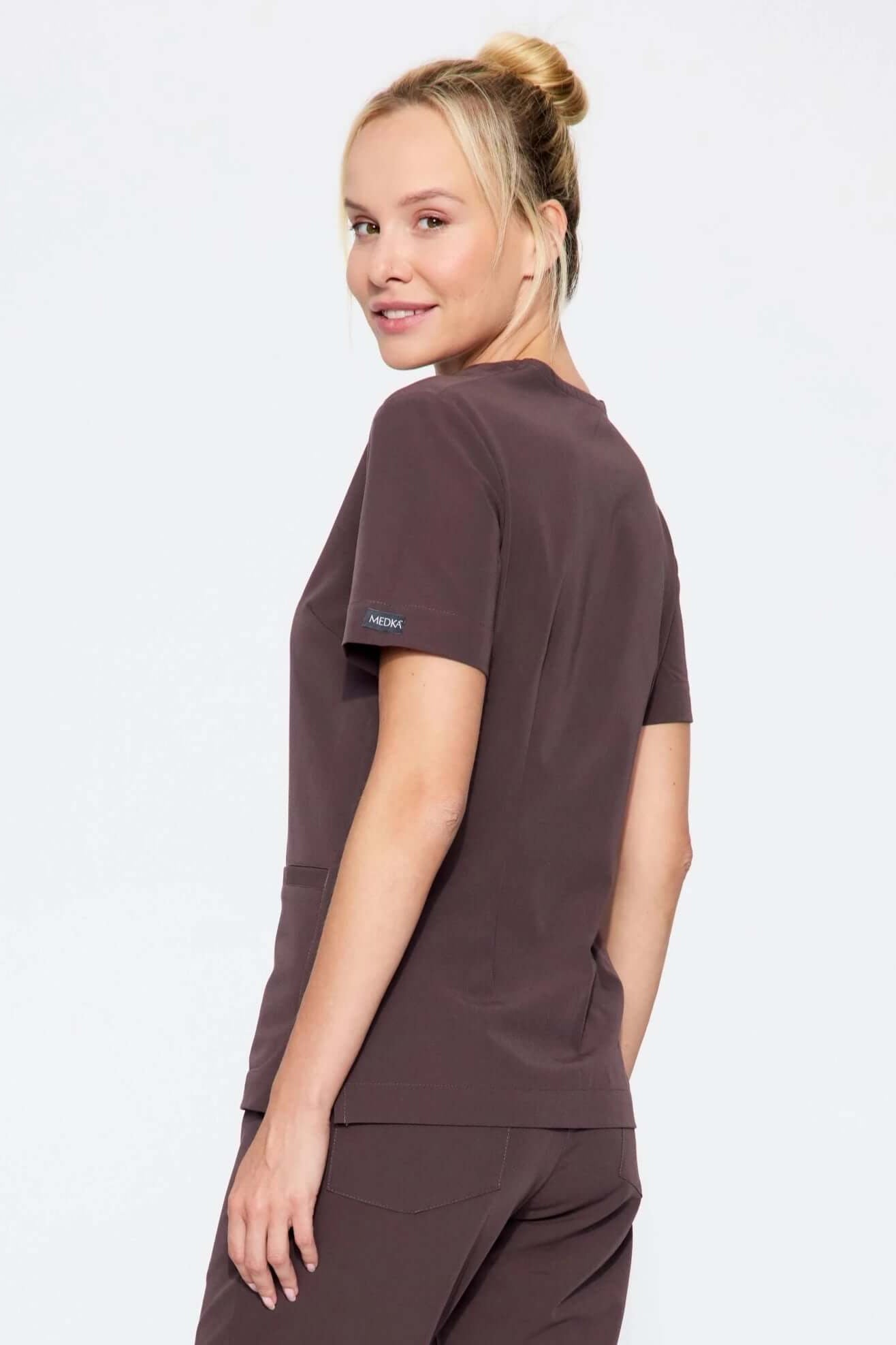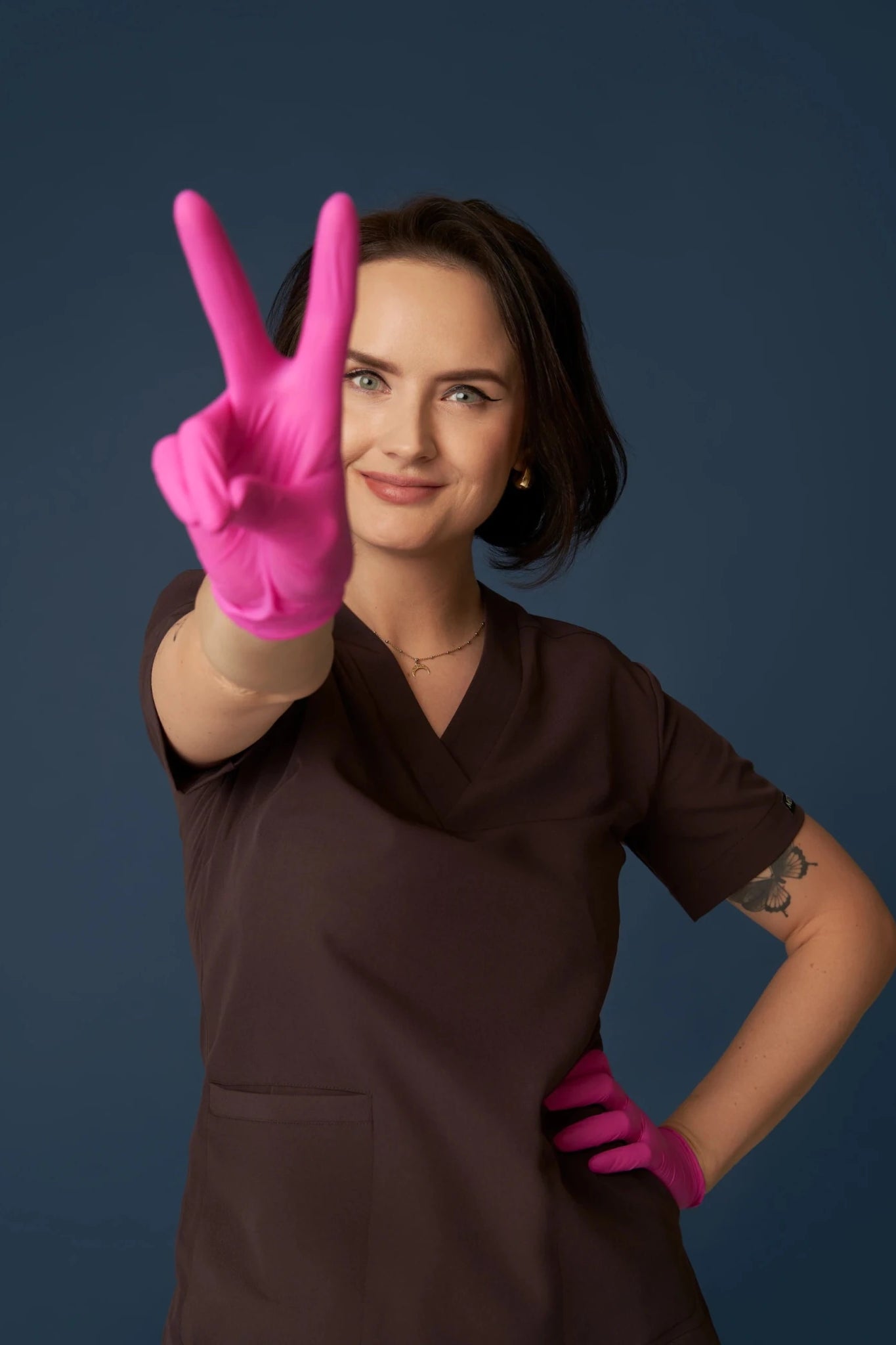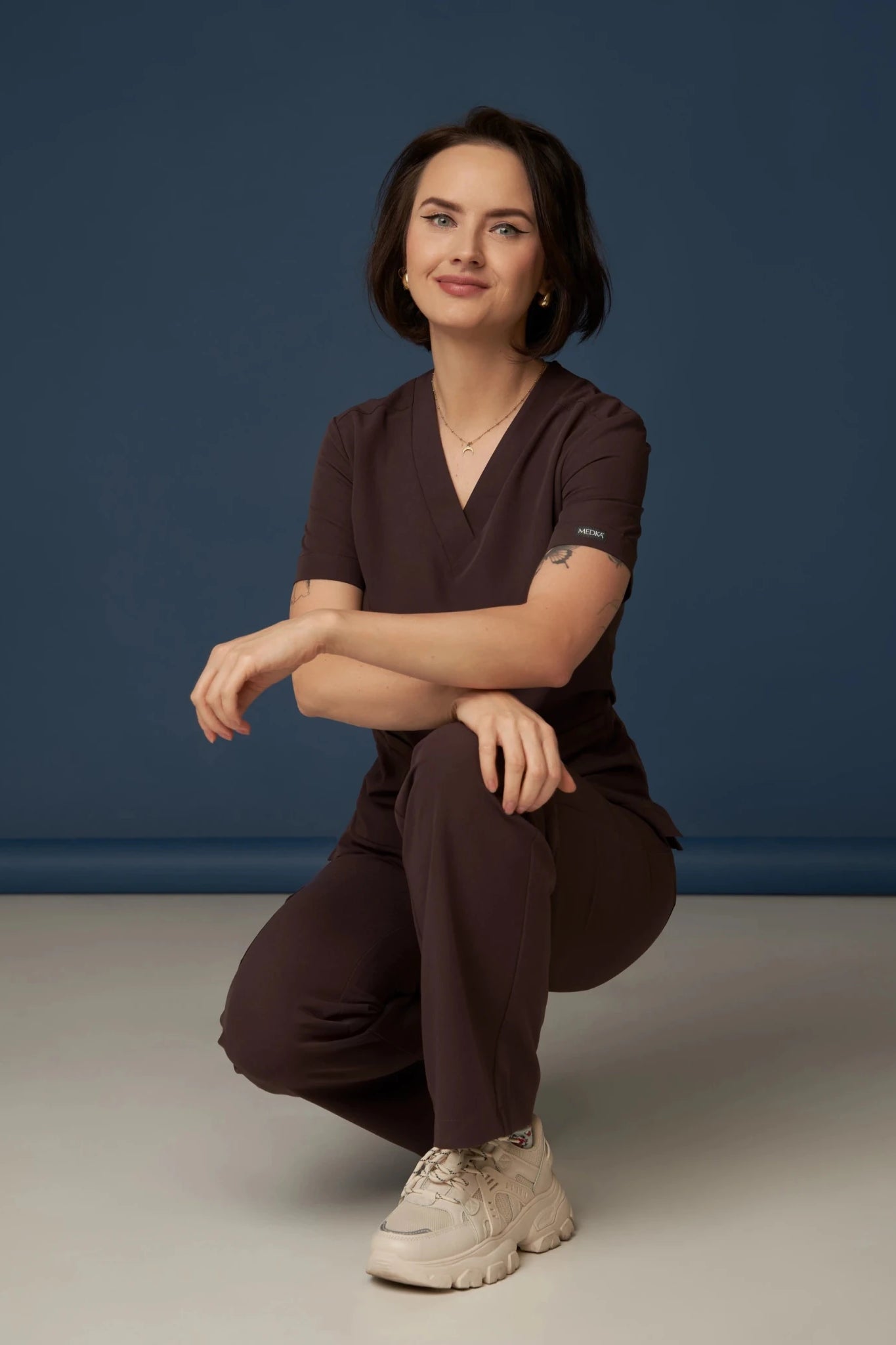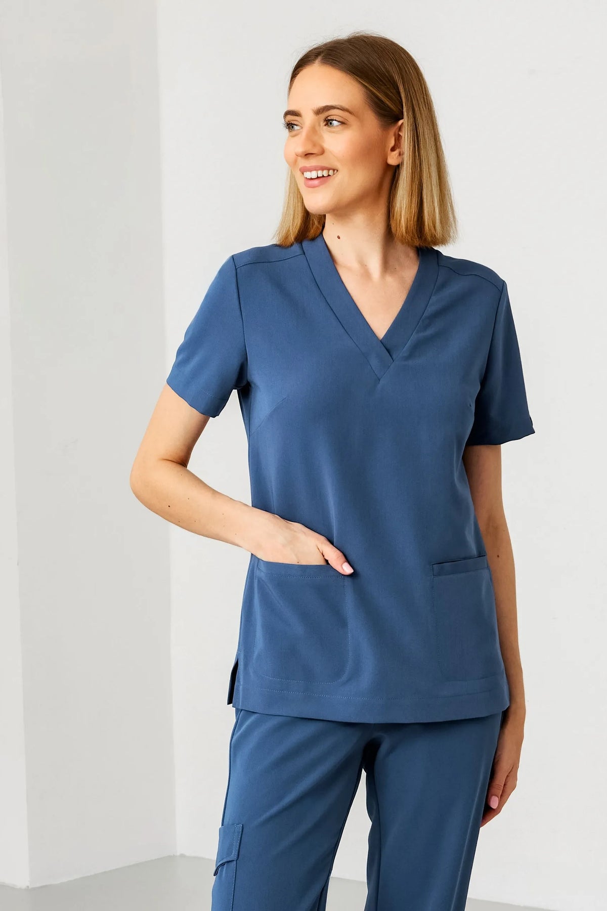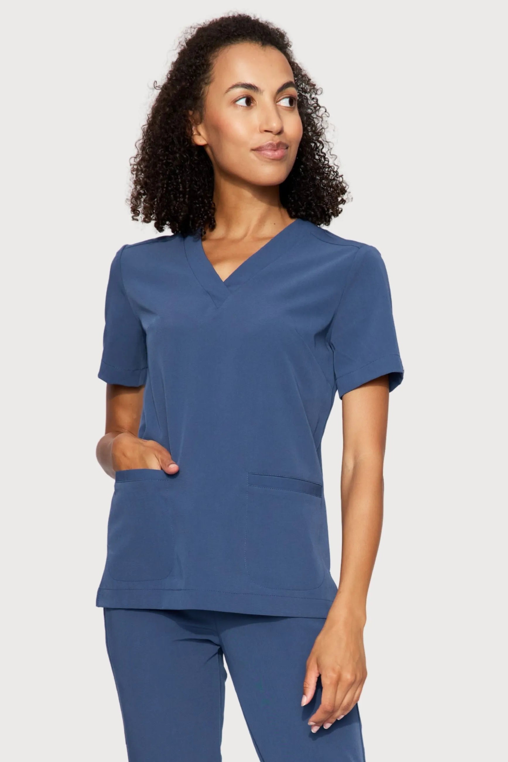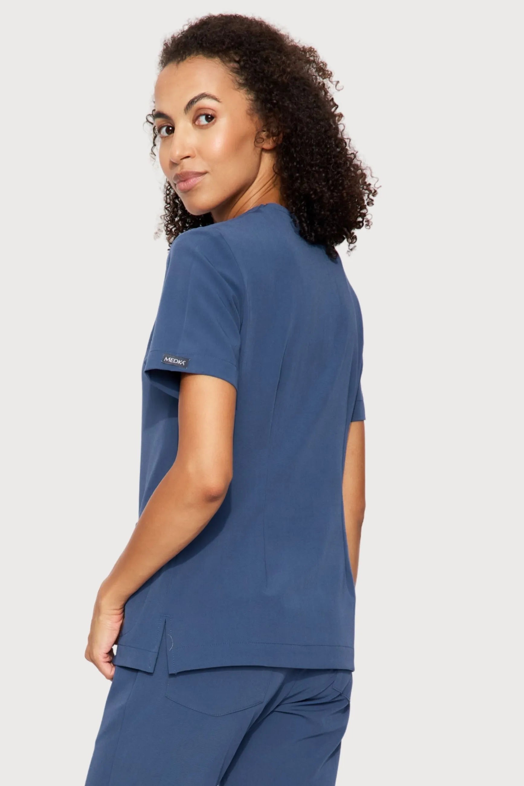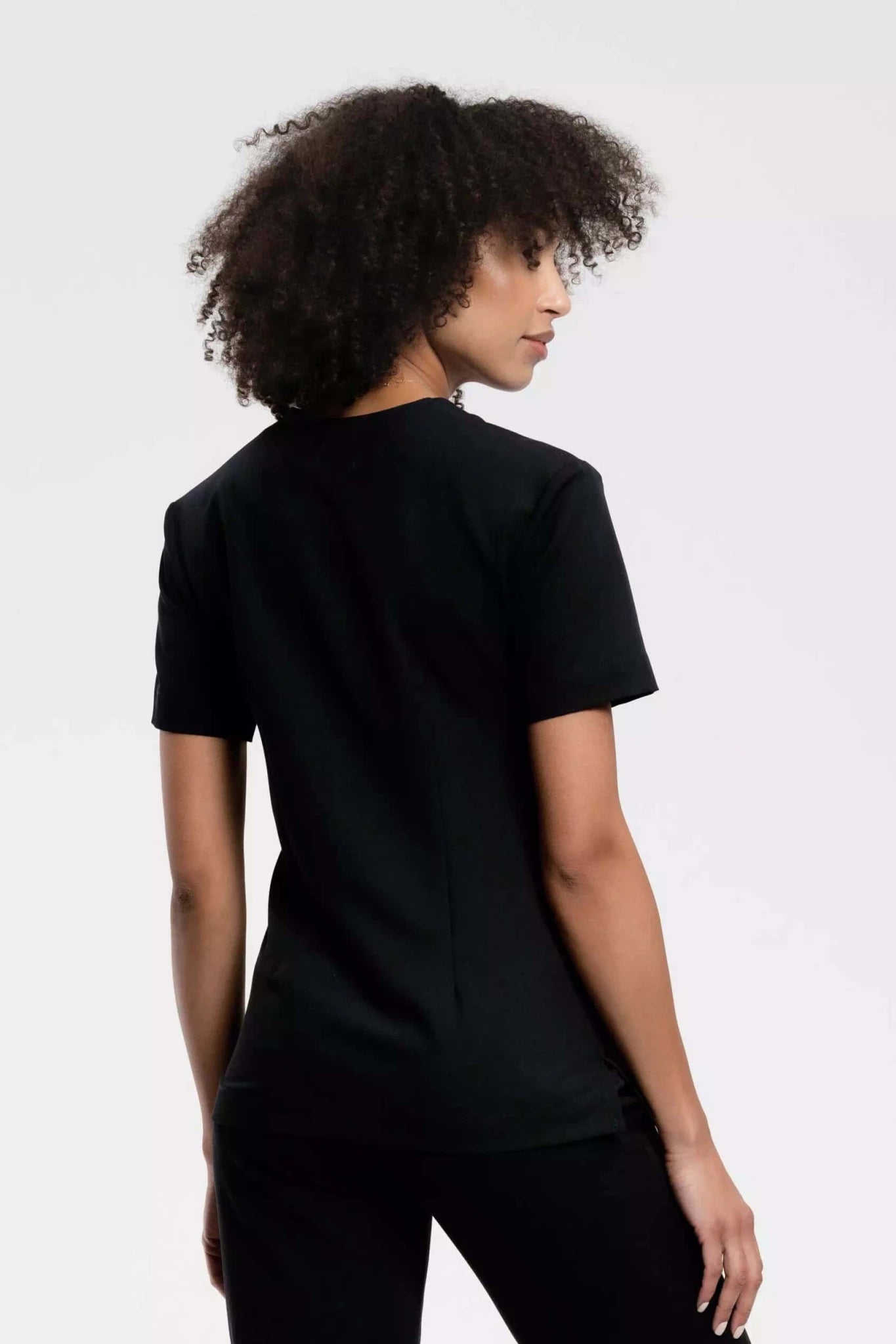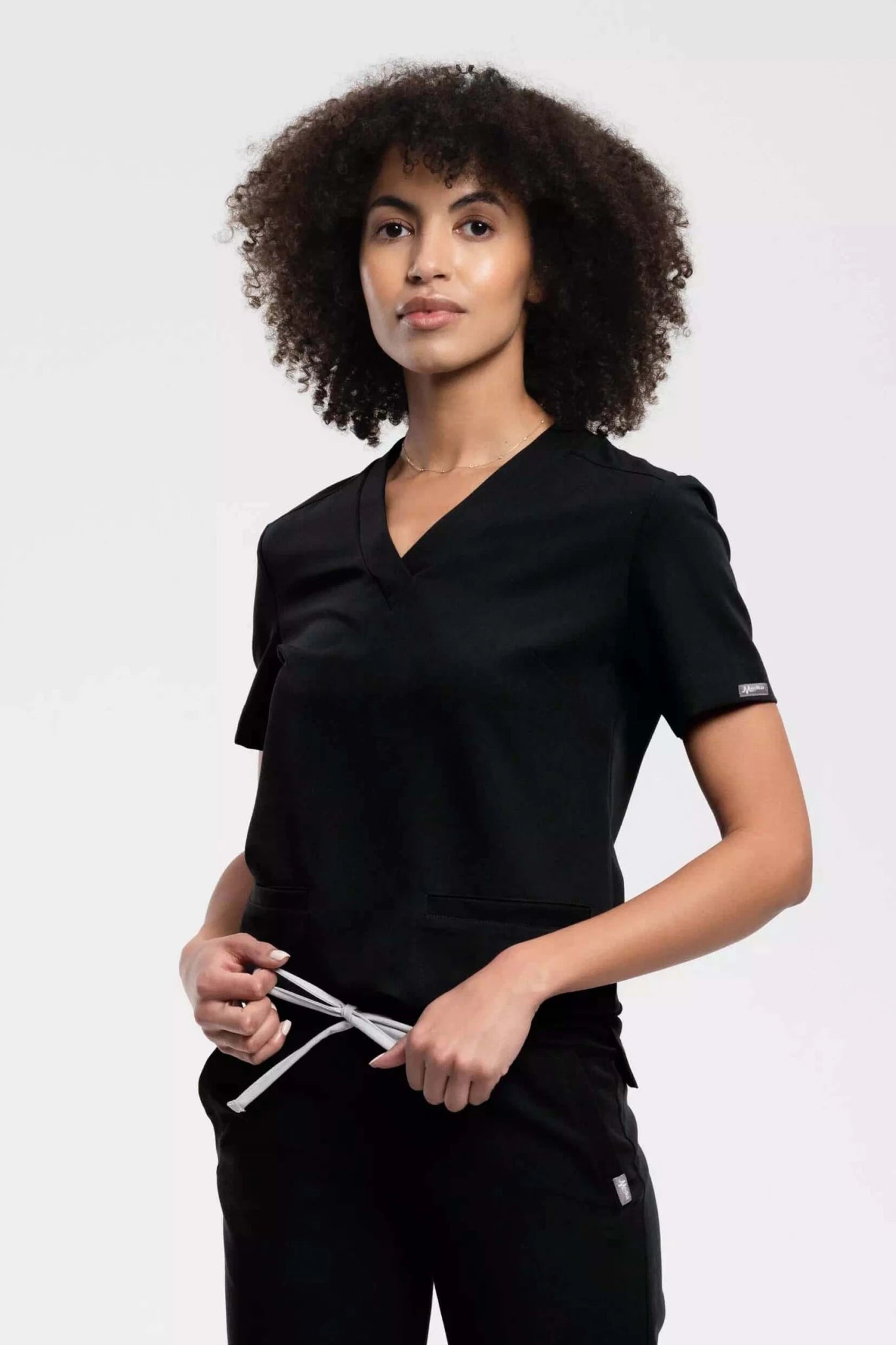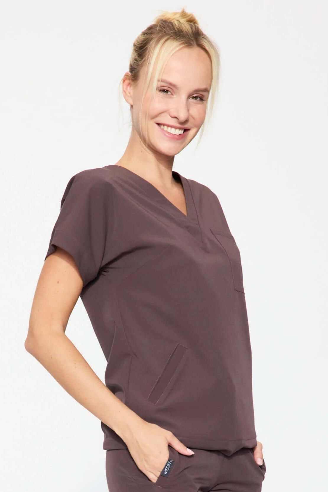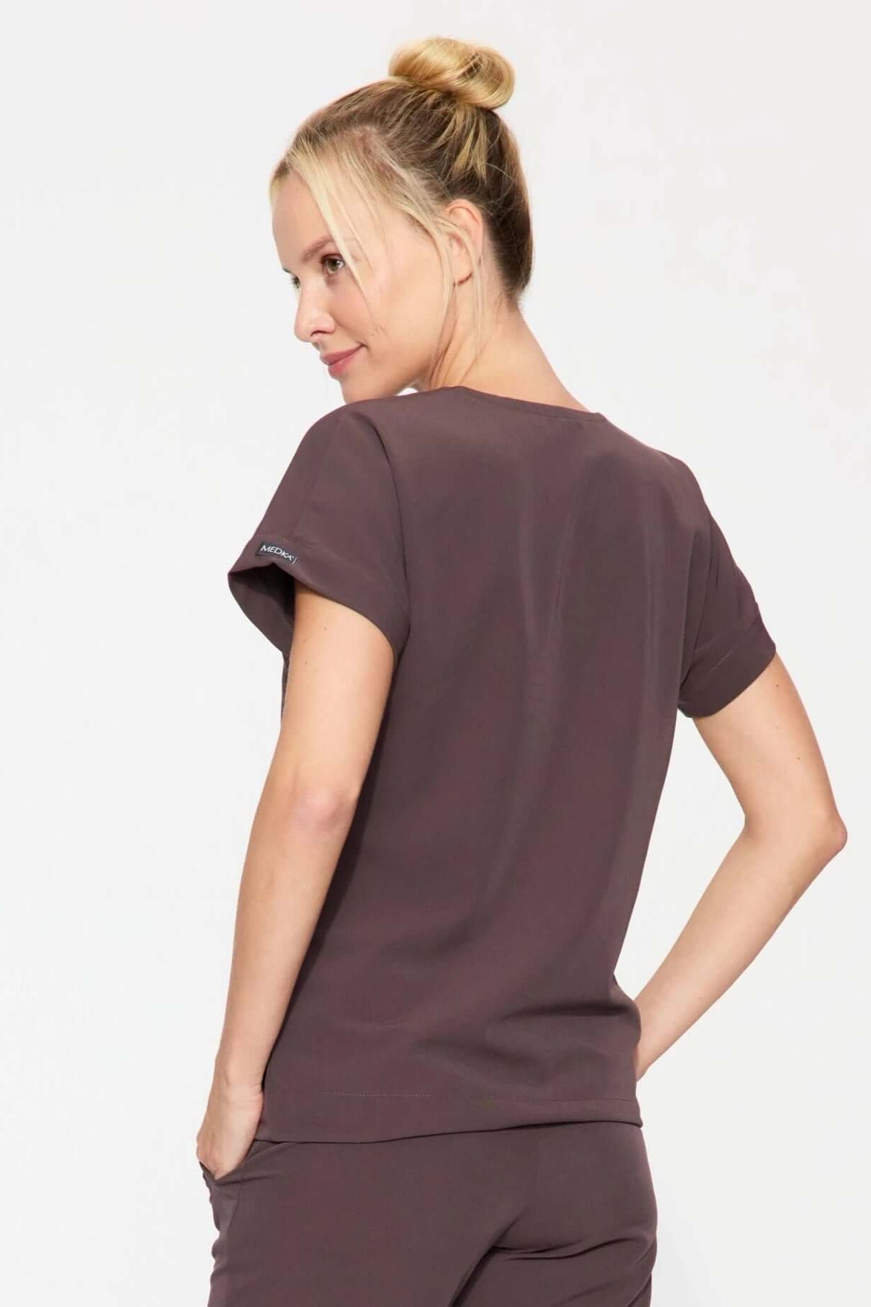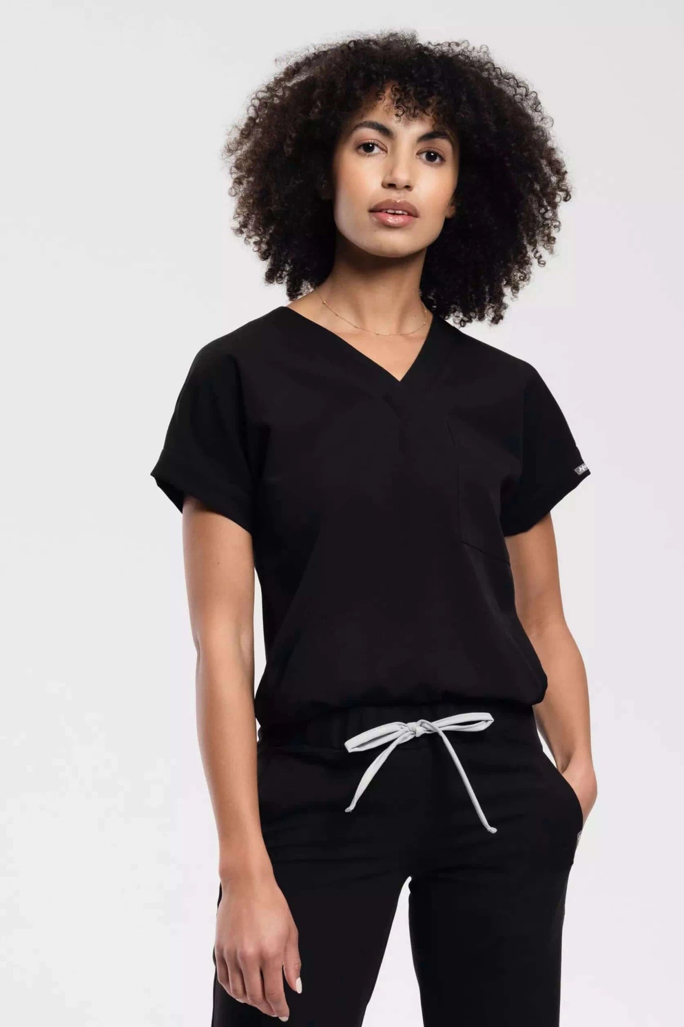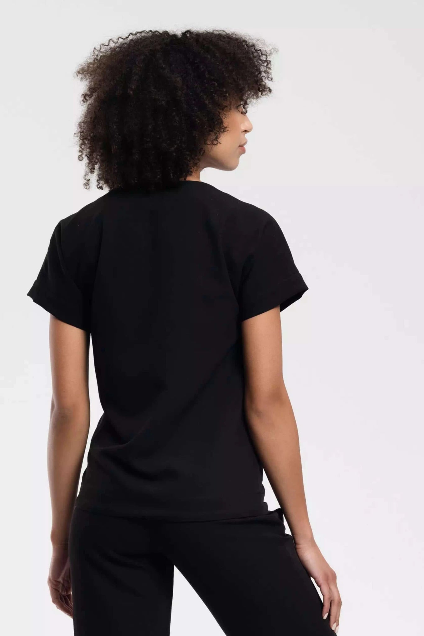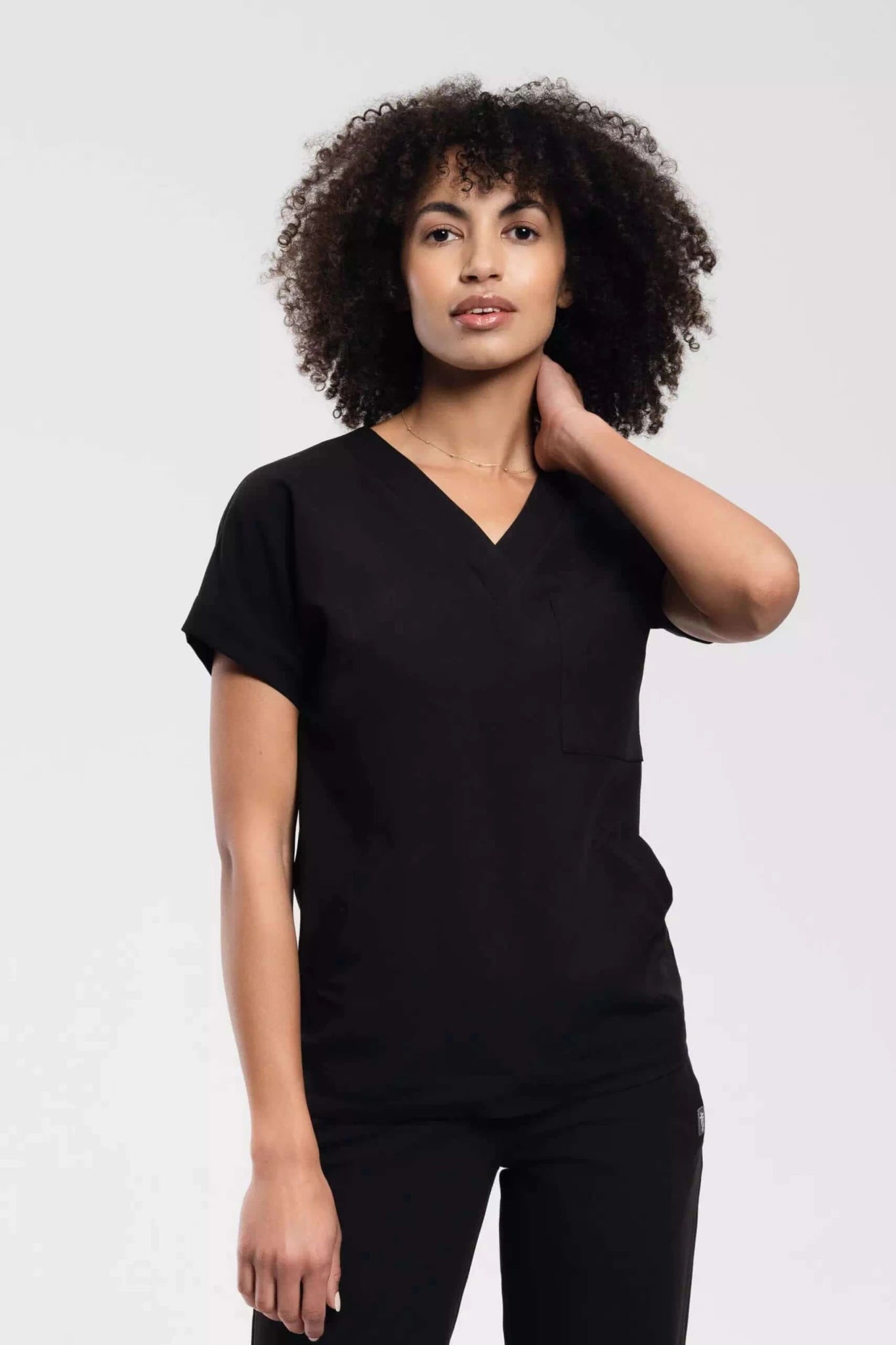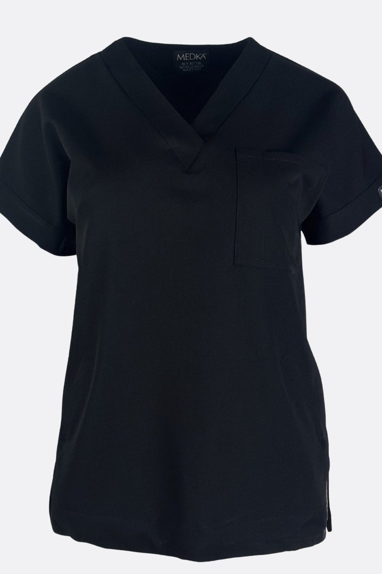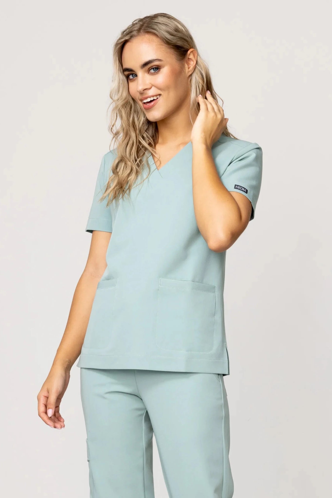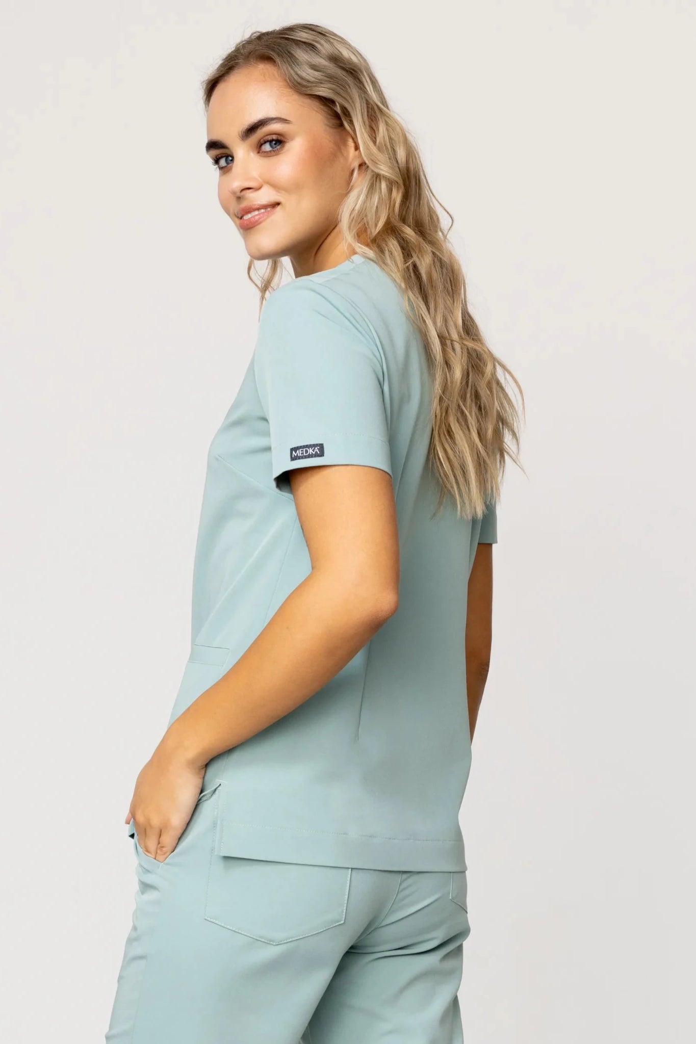





The wall in the office is the largest color surface that the client can see throughout the entire treatment. Scrubs are the second. These two surfaces work together, whether you want them to or not: they either conquer each other, or one eats the other. The most common mistake is not choosing an "ugly" color, but choosing a shade that looks great in the product photo in the store and fades out against the background of your specific wall, in your specific light. There is also something that few people think about before purchasing: the color of the sweatshirt is reflected on the face of the customer lying under the lamp. When choosing permanent makeup or choosing foundation, this can actually change your assessment of your skin tone.
Why isn't this just a matter of aesthetics?
Let's start with the most practical thing, because it sets everything else. The color of the fabric you are wearing becomes a source of reflected light. You lean over the client's face from a distance of thirty or forty centimeters. A bright, saturated sweatshirt then acts as a small reflector: it casts a delicate glow of its own shade on the skin.
With a manicure it doesn't matter. In treatments where you assess skin undertones, it is of great importance. A hot pink sweatshirt adds a warm, carmine reflection and makes the skin appear pinker than it is. If you choose eyebrow pigment or foundation shade based on this, you are correcting something that is not there. A green or sage sweatshirt works the other way round and neutralizes the erythema, so you may not notice any real irritation after the treatment.
There is also a second mechanism: metamerism. The same phenomenon known to every person who does permanent makeup. Color is perceived differently depending on the type of light falling on the object, and cool lighting in the office enhances blue tones, while under the warm light of home bulbs the same pigment may appear more red or coppery. Exactly the same thing happens with the paint on the wall and with the fabric of the scrubs, except that no one checks it before purchasing it. You buy a set in the "beige" color seen on the monitor or in a store under fluorescent lamps, and then put it on in a room where the wall is slightly cream and the treatment lamp is neutral, cool white. Beige suddenly turns grayish and dirty.
Treatment rooms usually use LED lighting with a neutral color, around 4000-5000 K, so that it does not distort the perception of skin colors, details and texture. This light is merciless to warm, off-color beiges and to everything that has a low-quality gray in it. A polyester-blend fabric that looked soft in warm light can show a synthetic shine in neutral light.
How to actually diagnose the color of your own wall?
Before you start browsing scrubs, you need one piece of information that most people don't have: whether your wall is warm or cold. It's not about the color name from the paint card. "Grey" can be bluish, greenish or pinkish, and this changes everything.
The test is trivial. Place a sheet of clean, A4 office paper against the wall, preferably during the day, with the operating lamp on. If the wall looks yellowish, creamy or peach next to the white paper, it is warm. If it looks bluish, steely or slightly purple, it is cold. If it's hard to tell, you have a neutral color and are in the most comfortable situation.
Do the same thing twice: once in daylight with the lamp turned off, once in the evening with only artificial lighting. Very often the wall changes its character. Sage green, popular in beauty salons, looks cozy and slightly olive under warm light of 2700 K, and at neutral 4000 K it becomes cool and hospital-like. If you have both sources in your office, and you usually do, the color of the scrubs must withstand both situations.
It's also worth checking the invoice. The same color looks lighter on a smooth surface, and darker and less intense on a rough, textured surface; matte paint will seem warmer, and polished paint will seem colder and reflecting other colors. A wall finished with tile paneling or vinyl wallpaper will reflect the color of your sweatshirt back to you. A matte, opaque wall will do this only to a minimal extent.
Contrast or camouflage?
This is where the first real design decision comes into play, not just a matter of taste. You have two strategies and they lead to completely different results.
The first is contrast: the scrubs are clearly darker or clearly lighter than the wall. Your silhouette stands out from the background, you are visually legible, the client can see you clearly even when lying down and looking to the side. This works well in small offices where the wall is very bright and you need to "mark" your presence. It also works well on social media: the treatment report shows where you end and where the wall begins.
The second one is camouflage, i.e. scrubs in a tone similar to the wall, but moved two or three tones deeper. The effect is more luxurious and quiet, the office gives the impression of a coherent design. The risk is that if you fit too closely, you blend into the background and end up looking like a blur in photos. The limit is approximately thirty percent difference in brightness. Below this it becomes unreadable.
However, there is a situation in which camouflage is a bad choice regardless of aesthetics. If you are photographing the effects of the treatment and you happen to have your own hand or arm in the frame, the background and your sweatshirt in the same shade will take away the depth of the photo. The client's face then loses its modeling because the camera has no reference point for white balance.
| The situation in the office | Recommended strategy | What to avoid |
|---|---|---|
| Very light wall (white, vanilla, light beige) | Contrast: medium and dark tones, e.g. indigo, olive, chocolate | Whites and creams that blend into the wall |
| Dark accent wall (bottle green, graphite, navy blue) | Camouflage in the same family or bright contrast | Blackness that blends with the background and deepens the darkness |
| Powder pink / misty rose wall | Neutral cool grey, white, deep plum | Pink in a different shade, because similar differences look like a mistake |
| Sage green | Beige, chocolate, indigo, possibly darker olive | Green with a different undertone, e.g. emerald next to sage |
| Neutral light gray | Practically everything, the greatest freedom | Overly saturated colors that scream in the cool light |
Which wall colors are really common in beauty salons?
It is worth setting the starting point realistically. In Polish beauty salons and aesthetic medicine studios, several solutions dominate and you will choose your outfit with them.
The most common are very light neutrals: off-white, vanilla, light beige, warm gray. The reason is practical, not fashionable. Light colors of walls, countertops and floors make it easier to quickly detect dirt, allowing staff to react immediately. Moreover, such a background does not distort anything in the assessment of the skin.
The second camp consists of natural, muted colors. Olive green adds elegance, sage green has a soothing effect, and bottle green looks luxurious; warm beiges and shades of sand combine well with powder pink, which returns in subdued, dirty versions. The third one, more and more common, is one accent wall in a strong color: graphite, navy blue, deep green, terracotta.
This third situation is the most difficult because the office then has two different backgrounds. A rule that works: choose scrubs that match the wall you are standing in front of during the treatment, not the prettiest one. The accent wall is usually behind the customer as she enters or behind the reception desk, so she can see her for five minutes. The wall behind the couch accompanies her for an hour.
How to match specific shades from the scrubs palette?
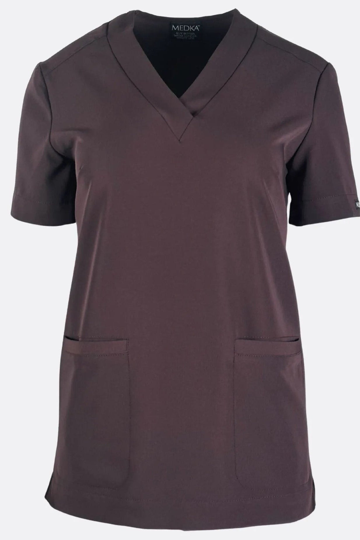
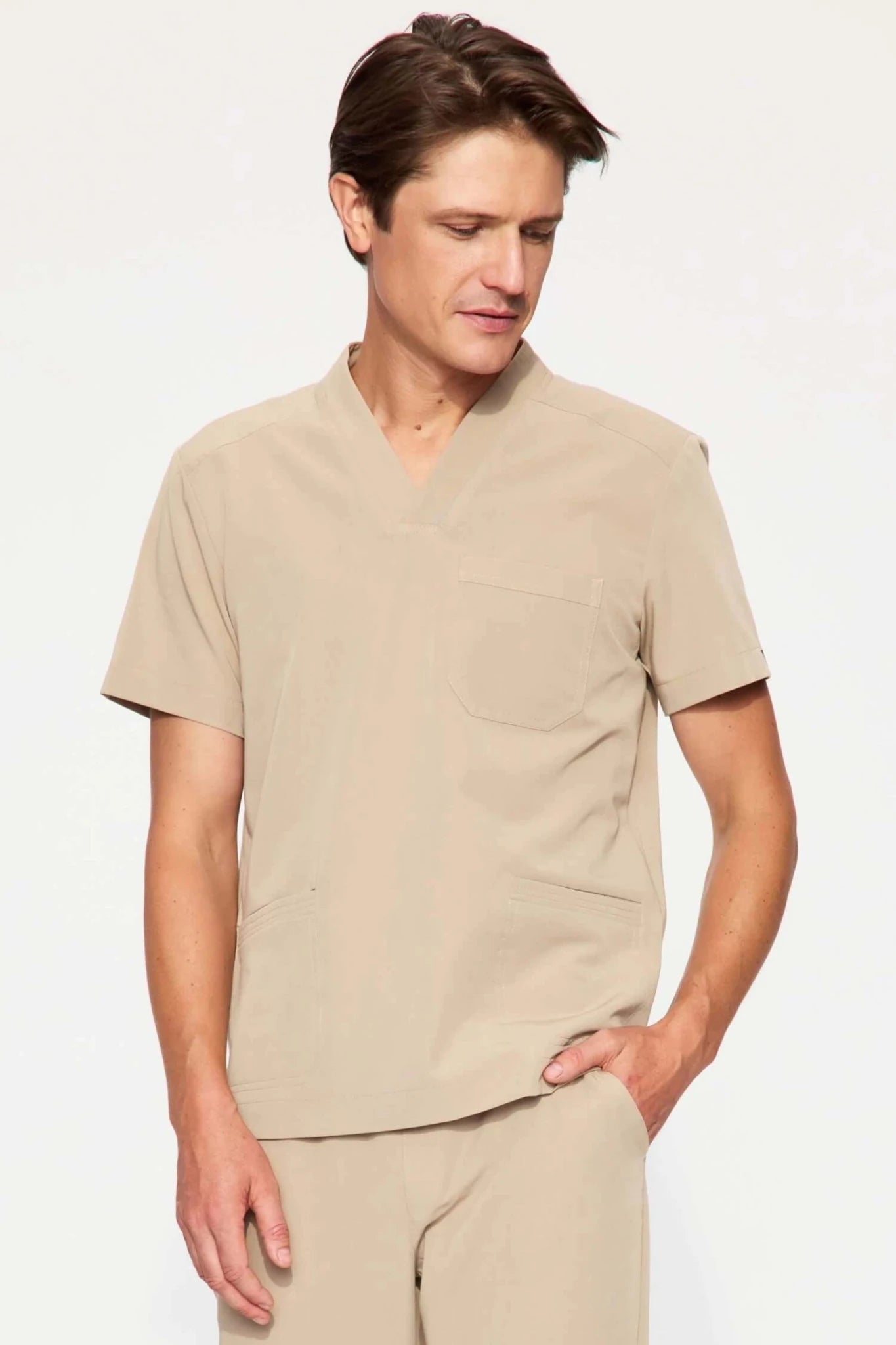
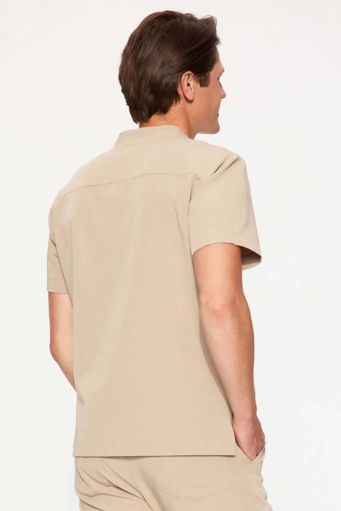
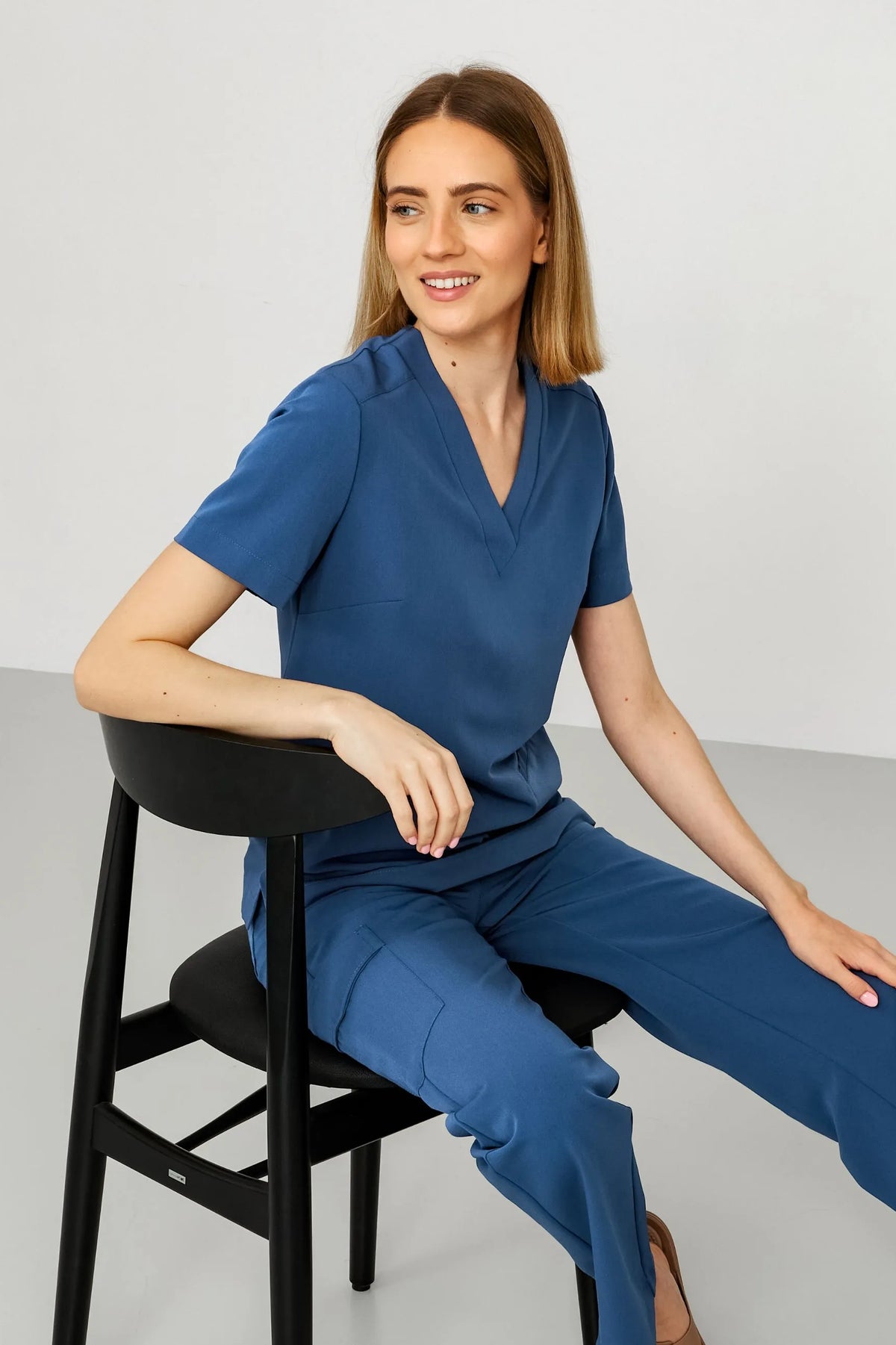
Let's get down to business. Contemporary stores with medical clothing they use palettes of several dozen shades, which paradoxically makes the choice difficult. In the medka.eu offer, apart from the classics, you will find names such as vanilla, silver moon, sage, misty rose, indigo, olive, chocolate and emerald green, as well as cool blues such as crystal blue and sky blue. It's a palette wide enough to reach almost any wall, but also wide enough to get lost in without method.
The method is this: first determine the wall temperature using a piece of paper, then choose scrubs with the same temperature and base the difference on brightness, not color. A warm wall plus warm scrubs in a different intensity look intentional. A warm wall plus cold scrubs looks random, unless you do it very consciously and strongly.
| Wall color | Temperature | Scrubs that sit down | Why it works |
|---|---|---|---|
| Vanilla, creamy white | heat | Chocolate, espresso, snuff, olive | The same warm base, large brightness difference, clear silhouette |
| Beige, sand | heat | Espresso, red fox, deep olive | Tonal effect, the office looks designed |
| Sage | warm-neutral | Beige, vanilla, chocolate, indigo | Beige gives softness, indigo gives an elegant contrast |
| Powder pink, misty rose | warm, slightly cool | Silver moon, white, black, deep rose | Neutrals do not compete with the pink of the wall |
| Light cool gray | cold | Indigo, navy blue, crystal blue, black | All in a cool family, consistent under 4000K light |
| Graphite, accent wall | cold | White, silver moon, sky blue | The brightness contrast saves the readability of the silhouette |
| Bottle or emerald on the wall | cold-deep | White, vanilla, beige | Dark on dark extinguishes the interior and dims the face |
Notice one thing in this table: black rarely appears. This is not a coincidence.
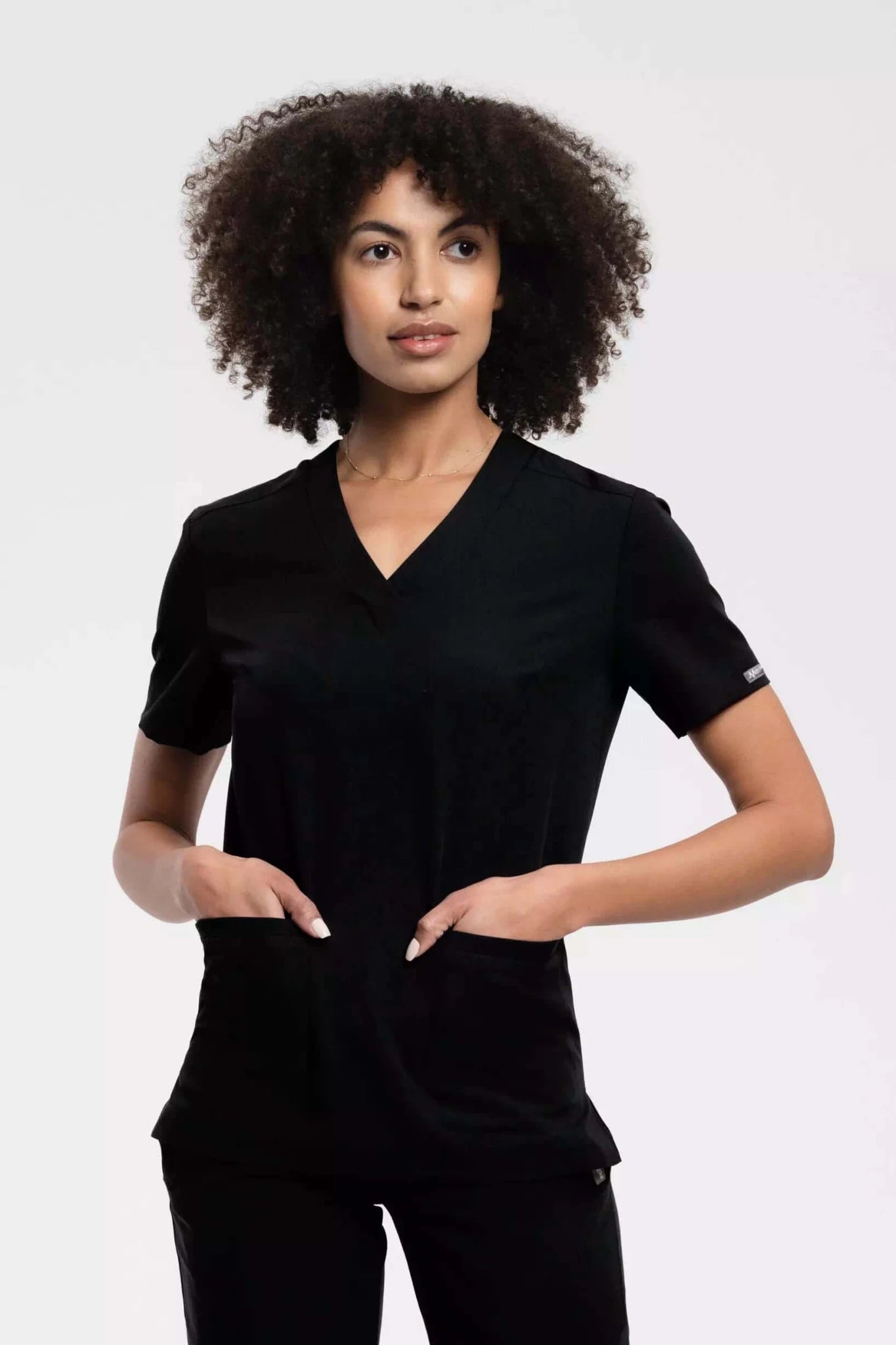
Black scrubs: when does it work and when does it sabotage the treatment?
Black is the default choice in the beauty industry because it looks elegant, is free of wax, oil and pigment, and matches any decor. It's all true. But there are two situations where a black sweatshirt works against you.
The first is a dark wall. Black scrubs in front of a graphite or bottle wall create an effect that in photography is called loss of plane separation. The client lying on the armchair sees a silhouette without an outline above her. The interior is becoming heavier than the designer intended.
The second one is more serious and concerns precision procedures. Black absorbs light. By leaning over the face of the client wearing a black sweatshirt, you create a shadow zone above her, which reduces the actual amount of light reaching the work area. With permanent makeup, eyebrow micropigmentation or manual cleansing, where every nuance of visibility counts, this is a tangible loss. It can be partially compensated with a shadowless lamp, but not completely.
It is also worth knowing how customers perceive black. Research shows that patients associate green scrubs with surgeons and blue scrubs with professionalism, while black scrubs may inspire less trust; navy blue shades are the most trusted. In a beauty salon, where the relationship is close and repeatable, this effect is weaker than in a hospital. But on the first visit, during an invasive procedure, with an uncertain client, navy blue or indigo will do more good than black.
Black still makes sense where the wall is very light, the work is mainly done on hands or nails, and you need a color that forgives stains. For a nail technician facing a white wall, black remains a choice that is hard to beat.
What happens when the color of the scrubs enters the frame of the "before and after" photo?
This is the piece of the puzzle that almost always falls out of the equation, but it determines half of your marketing.
Your phone's camera sets the white balance based on what it sees in the frame. If there is a light gray wall behind the client's face and your hand in a deep rose sweatshirt enters the corner of the frame, the phone will adjust the temperature of the photo towards green to neutralize the dominant red. The client's skin will turn slightly olive in the photo after the treatment. The illuminating effect that you actually achieved will disappear.
The same mechanism works to your advantage if you use it consciously. Neutral scrubs, i.e. white, silver moon, light gray or pure navy blue, are a convenient reference point for the camera and stabilize the white balance. The before and after photos from the series are then comparable to each other, which is invaluable for the portfolio. If you are publishing effects, it is worth choosing one neutral set for the session and keeping it only for photos.
The third variant is scrubs color-matched to the salon's logo. This solution makes sense in terms of image, but it only makes sense if the logo color is neutral or deep. A brand with a light green logo that dresses its team in light green scrubs in front of a light green wall will get an office where everything is the same color and nothing is visible.
The office where changing the color of the sweatshirt fixed the photos
A beautician who runs a single studio in a tenement house decorated the interior in a fashionable set: sage green walls, light wood, gold accents, one wall behind the couch in the same shade of green. She also bought a set of sage-colored scrubs to make sure everything matched. It looked consistent in the visualization.
After a month of work, two problems appeared that were not related to each other. First: the clients in the photos after the cleansing treatment looked worse than before. The skin was grey, the erythema after extraction turned out strange, brownish. Second: Instagram feeds of roller work looked flat, as if everything was one blur.
The cause was a combination of three things. The green wall reflected green light onto the face. The green sweatshirt added a second reflex up close. The camera, seeing the predominance of green in the frame, compensated for it by shifting it towards magenta, which made the blush in the photos look unnaturally brown. Additionally, the lack of brightness difference between the sweatshirt and the wall made the video lose depth.
The solution did not require renovation. She left the sage wall and replaced the scrubs with two sets: chocolate for everyday work, light beige for photo sessions. Chocolate provided a brightness contrast that cut out the silhouette from the background and, more importantly, stopped adding green reflections to the skin. Beige turned out to be a neutral point of reference for the camera. Effect photos no longer require processing.
The conclusion that follows from this is perverse. The worst possible match between scrubs and the wall color is a perfect match. Visual consistency arises from tonal affinity, not from repetition of the same shade.
To whom does all this matching make no sense?
Honestly: not every office needs this analysis.
If you work in a rented space in a living room, the interior of which you do not control and which changes every few months, matching scrubs to the wall is an investment in something that is not durable. Buy neutral navy blue or graphite and stop thinking about it.
If your treatments do not require the assessment of skin tone at all, i.e. you work on nails, eyelashes, hair removal, the entire section on color reflection does not apply to you. Then only the image and photographic thread remains, and it is soft.
If you work in a larger team, the priority is no longer the wall, but role recognition becomes a priority. Literature reviews on color in the healthcare environment indicate that color systems reduce the risk of staff identification errors. A beautician, assistant and receptionist in three different shades of one color family is a better solution than a uniform color perfectly matched to the paint.
And one last, honest reservation: there are no studies that would link the color of a cosmetologist's scrubs with the client's satisfaction or the decision to return. Everything that can be said firmly on this matter concerns the physics of light, photography and visibility during work. The rest is image consistency, which has value but cannot be measured.
Before you open the store and start choosing
The order matters. First, determine whether your wall is warm or cold and check it twice, in daylight and artificial light. Only then look for the color of the scrubs at the same temperature, but at least thirty percent different brightness. If you are performing treatments that require the assessment of skin undertones, cross off your list everything that is both light and saturated, because these are the shades that reflect the most colored light onto the client's face.
Keep a separate, neutral ensemble for photo sessions. For everyday work, choose a shade that forgives the stains typical of your treatments. If one of these two purposes has to give way, the photographic one will give way, because the photo can be taken in a different outfit, and the stains remain forever.
One last thing that's easy to forget in tables and rules: you're supposed to wear this garment for eight hours a day. A color that makes you feel bad will be visible in your posture long before anyone notices that it doesn't match the wall. Many stores, including medka.eu, now allow you to see the selected model and shade in your own photo before purchasing. It's worth taking advantage of this by taking a selfie in the office, against the wall and with the light in which you actually work.
Frequently asked questions:
Below are short, specific answers to the most frequently asked questions on this topic.
Do scrubs have to match the color of medical shoes? They don't have to be, but the color temperature difference is visible. White shoes look gray next to warm beige. It's safe to keep your shoes in white, black, or a color similar to your pants. What matters more than color is that the shoes are uniform throughout the entire team.
What color scrubs best mask henna and pigment stains? Chocolate, espresso and snuff. Dark, warm browns absorb traces of eyebrow pigments and autobronzer almost completely. Black camouflages equally well, but shows dust, powder and cotton fibers.
Is it worth having different colors of scrubs for different days of the week? It only makes sense if each set has a function: one for dirty treatments, one neutral for photos, one representative for consultations. Rotation for the sake of rotation blurs the recognition of the office and makes it difficult for clients to associate you with one image.
Should the color of the walls be matched to the logo or vice versa? The wall is more durable and more expensive to change, so this is usually the starting point. The logo and scrubs match it. The exception is when the brand already has a recognizable corporate color and is building an office from scratch.
How to check the color of scrubs before purchasing if I buy online? Product photos are taken in studio light and almost always show the color brighter and cleaner than in reality. Ask the store to take photos of the fabric in daylight, or use an online fitting if the store offers it. It is also worth ordering one set as a test before dressing the entire ensemble.
Is a white sweatshirt still a good choice in a beauty salon? In front of a very light wall, the white loses the outline of the silhouette, and in warm lighting it turns optically yellow. However, it works well in front of a dark accent wall and for work requiring the maximum amount of reflected light. It also has a practical advantage: it can be whitened.
How many sets of scrubs are needed to start a one-person office? Actually three: two work clothes in the same color, bought in one batch, and one neutral one for photos and consultations. Two sets are only enough if you wash every day, which shortens the life of the fabric and accelerates color fading.